Object styles are located both in the project and in families. Every family, system and annotation category has atleast one object style. They are used to control globally how an object is displayed with regards to lineweight, colour and type. These can be overridden per view or changed throughout a project either in your "visibility graphics controls" or your "settings->Object Styles" respectively.
In a family:
When you are in a family going to settings->Object Styles can create new subcategories for elements that will enable them to be turned off or their display manipulated without changing all elements in that category. For example:
Say we have a generic model family and we create a new object style by going to our object style settings, clicking NEW and selecting sub-category of generic models and name in "Signage". We could then select individual solid geometries located in our family and go to their properties and set their subcategory to "Signage". Now if we were to load this family into a project we could turn off signage in our visibility settings and it would just turn off these geometries whilst keeping on our other generic models.
The other items that are created when adding a new object style are new linetypes (this is where some people become confused as in families you do not create new linetypes you create new object styles). If we were to select symbolic lines in our family you'll note that two new linestyles are now selectable. That is, Signage (cut) and Signage (projection). Similarly lines drawn in this object style can be turned off or manipulated independant of all generic models as previously outlined.
In a project:
In Settings->Object Styles in a project we can change how a particular sub-category or category is displayed globally throughout the model by editing its properties. You'll note we have multiple tabs, for model, annotation etc for the different classes of elements.
These can also be overridden per view to enable exceptions to the graphical display of these elements for paricular views.
Discussions of my experiences of Revit and various work processes/tricks that I have implemented to utilise the program effectively. I have been using revit since August 2001.
Wednesday, April 12, 2006
Nested Arrays & Formulas
I have recently updated my tutorial for nested arrays and formulas which was getting quite old. The tutorial is available here: Nested Families & Arrays
Just in summarisation though, best practices when creating parametric arrays:
1. Always use nested families for elements that are to be arrayed
2. Always constrain the two defining elements of the array in all 3 axis. (defining elements are either the first and second or first and last depending on which option you've selected when creating your array)
3. Always constrain your arrayed elements by dimensioning to their origins. (their origin is the intersection of the three "defines origin" reference planes - THIS SHOULD BE LOCATED AT A LOGICAL POINT THAT YOU WANT TO CONSTRAIN TO, TO AVOID EXCESSIVE DIMENSIONS AND PARAMETERS)
Hopefully this quick cheat sheet can be used to diagnose issues with malfunctioning arrays.
Sunday, April 09, 2006
Making "Elevation" tags look like Section Heads (pre-Revit 2011)
Okay, so we can't yet make elevations look the way we want them to. This is my typical workaround that i use in my office where the elevation appearance is critical (functionally you are still better using the elevations).
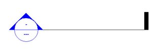
Begin with a standard section:
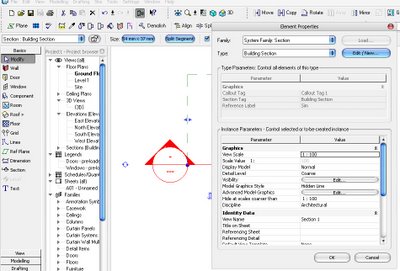
Now select it and go to its properties and choose Edit/New:
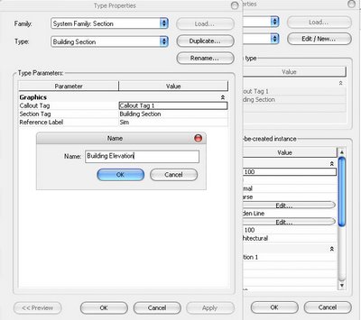
Now we want to duplicate this section type and call it "Building Elevation" for example:
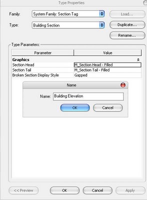
Now if we Okay out of each of these windows and goto our Settings-->View Tags-->Section Tags... Settings, we can create a new section tag type called Building Elevation and set it to have Section Tail = none:
Now we need to select our section and go to its properties and tell it to use this new section tag type that we have created:
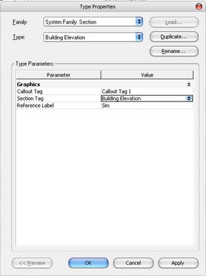
We should now have a section that uses the Section-Building Elevation type and it doesn't have a tail:

Now if we select this section again, and drag the section line end point back to the head, MAKING SURE TO LEAVE A SMALL EXTENSION PAST THE HEAD (otherwise we'll have difficulty actually using the section/moving it etc):
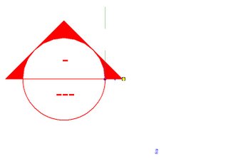
Finally its just a simple matter of adjust the sections crop regions so the head is roughly centred. Now we have a section tag that looks like an elevation marker and still has much of the same functionality. However it now looks how we want it to and all information (detail number/sheet number etc) are displayed within the actual marker, unlike elevation tags.
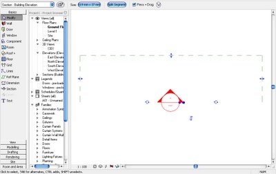
Begin with a standard section:

Now select it and go to its properties and choose Edit/New:

Now we want to duplicate this section type and call it "Building Elevation" for example:

Now if we Okay out of each of these windows and goto our Settings-->View Tags-->Section Tags... Settings, we can create a new section tag type called Building Elevation and set it to have Section Tail = none:

Now we need to select our section and go to its properties and tell it to use this new section tag type that we have created:

We should now have a section that uses the Section-Building Elevation type and it doesn't have a tail:

Now if we select this section again, and drag the section line end point back to the head, MAKING SURE TO LEAVE A SMALL EXTENSION PAST THE HEAD (otherwise we'll have difficulty actually using the section/moving it etc):

Finally its just a simple matter of adjust the sections crop regions so the head is roughly centred. Now we have a section tag that looks like an elevation marker and still has much of the same functionality. However it now looks how we want it to and all information (detail number/sheet number etc) are displayed within the actual marker, unlike elevation tags.

Personal Wishlist - Updated for RAC2008
There are many wishlists around but unfortunately none of them capture all that I'd like to see added/improved so I thought I'd post them. I believe it will also be a good reference for new users to see what isn't currently possible (without workarounds)... Note: some of these have been taken from the AUGI wishlist forums.
1. Elevation Tags
We need to be able to further customise these tags to achieve the standards we require. Whether this be by making them external families ala sections tags or simply allowing more options to customise their display.
2. Filtering of Sections by type (Now possible to an extent with the 2008 Hide in View tool)
How many of us spend countless hours using hide annotation in view to hide unwanted sections in a view. It would be great if we could filter the sections per view based on their type!
3. View Depth Clipping of Lineweights in section and elevation!
Sections/Elevations often look flat and are difficult to read, this needs to be implemented. Workarounds such as turning on shadows greatly increase printing time to an unacceptable amount.
4. Adding a new family category for SIGNAGE that has a setting that enables you to stop the signage from flipping when mirrored.
This would be great for mirroring projects.
5. Improved Site Modelling tools (Slightly improved in 2008 with the floor point edit tool)
Currently modelling things like kerbs that follow topography or having components located underground that display correctly in section (with earth hatch wrapping around them) are somewhat difficult to achieve.
DELETED 6. Improved handling of Groups (No longer an issue in 2008)
Groups can be somewhat unreliable with changes to a group often resulting in being unable to "finish group" and then having to ungroup and regroup certain items. Things like this need to be addressed.
7. Addition of further modelling tools (improved in 2008 with point edits...)
The ability to import SAT is great but it would be better not having to purchase another program in order to create complex NURB forms easily.
DELETED 8. The ability to have semi-transparent filled regions (available in 2008)
Sometimes there is the need to lightly hatch over an area without either fully blocking it out or making it too visible.
9. Ability to add views when working in an in-place family
All too often do we need to quit the family and setup some views in order to achieve what we're after...
9. A quick paintbrush tool for resequencing numbering of doors/windows/carparking etc when a change is made.
It's quite time consuming when a change occurs at door 2 and there are three hundred odd doors to renumber. Also when placing anything that is tagged they should have automatic sequential numbering based on your first selection/tagging method (numbers/letters etc).
10. The ability to have lettered revisions as well as numbered
I'm sure most architectural office use both letters and numbers for different stages of the design process. This needs to be implemented in order to make the revision schedule a valid tool, as well as the next item.
11. Greater ability to customise the way schedules appear.
We need the ability to rotate schedules so the column headers can be on the side or the bottom of the schedule. Also the ability to flip the direction in which new rows are added. For instance, the field at the bottom is filled first and subsequent fields added above as required.
12. Greater control of wall layer visibility.
Sometimes we need to only show structural layers of a wall in a view as the finish layers overcomplicate the drawing. Workarounds are not sufficient for this.
13. NON-RECTANGULAR crop regions!
This is very common practice. Having to filled region or masking region (2008) out the unwanted information is annoying and time wasting.
14. Views between sheets need to be able to be aligned
Maybe an underlay sheet tool would be good for this so we can ensure the views appear in the exact same location.
15. Allow true colour representation of views (improved in 2008 with transparent filled regions)
Often light pastel colours will show as white meaning we must use bright ugly colours in order to get differentiation between areas...
16. Rescaling of hatch patterns without having to find the pat file
Its annoying having to find the pat file again and re-import it just to rescale a hatch pattern.
17. A select all instances per view tool
Select all instances is great but there are times when you only want to select from what is shown.
18. Improved DWG Export
Dimensions and text when exported need to create new text and dimension styles instead of using "standard" as this will vary between computers. Also the location of text in dimensions and the witness lines should link to the AutoCAD dimension style settings instead of using proxy overrides.
19. Additional Text control tools (MODEL & DRAFTING)
If we are to improve upon the days of ole (AutoCAD) we need all the text control options that were available there. For instance, the ability to create oblique text, adjust character spacing and adjust text width factor in model text as well.
20. The ability to have decals appear in a shaded view
Those of us who need to show signage, it would be great is we could place these in a way that they display in a standard shaded view without the need to render the view or insert a jpg and line it up...
21. The ability to attach walls to stairs and have stairs join to floors
Stairs are still fiddly and don't have all the flexibilies required. Multi-level stairs need to be able to attach to floors (monolithic). Walls should be able to attach to the underside. Spiral stairs should be able to go further than 360°. Spiral treads need to overlap.
22. Better control of hosted Railings
Railings on stairs when their heights are incorrect, we need the ability to manual edit the 3D path to ensure the railing follows the appropriate angles etc. Although this is sort of possible some slopes are still difficult to achieve. It would also be great if we could tab select the balusters and adjust them individually as an override as spacings are rarely the same...
Subscribe to:
Posts (Atom)